
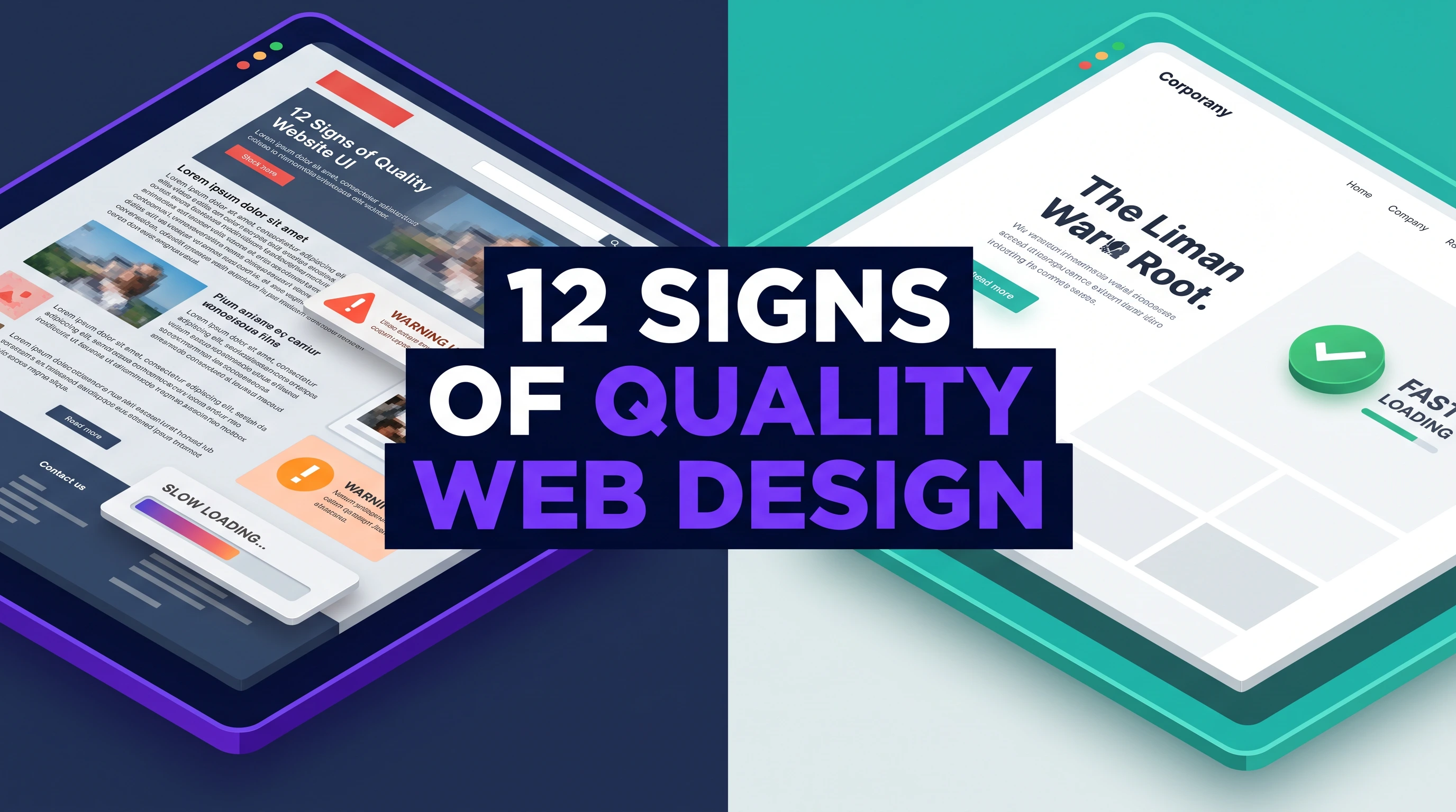
How To Spot Quality Web Design: 12 Signs Of Professional Work
- 26 min read
- Last updated: September 8, 2026

Written by
Ethan Weston
Growth Marketer
When you visit a website, do you have the impression that something is a little off?
It might be slow. Perhaps you are unable to locate what you are looking for. Perhaps it appears to have been constructed in 2005 and has never been tampered with.
You leave quickly.
Now think about the opposite. You click a link and everything feels right. The page loads fast. You know exactly where to click. The whole thing just works.
You trust that site. Maybe even buy something.
Here's the thing, most business owners can't explain what makes the second site so much better than the first. They just know it feels different.
But if you're paying for a website, you need to know the difference. Because good designers charge good money. And you should know what you're getting for it.
So today, we're going to fix that. I'm going to show you exactly what separates amateur sites from the pros. These are the signs of quality web design you can spot yourself, no design degree required.
Let's get into it.
Why Good Website Design Matters
Let’s understand this with an example.
There is a guy who paid $500 for a website a few years back. Looked fine on his computer. He was happy.
Then he started running Facebook ads. Sending people to his site. Spending money on every click.
And nobody bought anything.
Turns out, his “cheap” site was broken on phones. Took eight seconds to load. Had buttons that didn't work. Google noticed and buried him on page ten.
That $500 site ended up costing him thousands in lost sales.
Bad web design is expensive. Not because of what you pay upfront, but because of what it costs you in customers you never get. While good website design doesn’t do this!
Therefore, learning to spot signs of quality web design is one of the best investments you can make.
Sign #1: It Loads Fast
This is the biggest one.
If your site takes more than three seconds to load, people leave. Simple as that.
Google did a study a while back. If a site takes five seconds to load, the chance someone leaves jumps by 90 percent.
Think about your own behavior. When a site crawls, you're out. Back to search results. Next.
Professional designers care about loading speed. They optimize images. They clean up code. They don't load fifty different fonts just because they can.
How to check: Run any site through Google's PageSpeed Insights. It's free. If the score is under 80, that site has problems.
Sign #2: It Works on Every Device
Here's a scary fact: Most internet traffic today comes from phones.
Not computers. Phones.
So, if your site looks great on a big monitor but falls apart on an iPhone, you're invisible to more than half your potential customers.
This is called mobile responsiveness. Fancy term, simple meaning: The site adjusts itself to look good on any screen.
Professional designers build mobile-first these days. They start with the tiny screen and work up. That way, phone users get the best experience, not an afterthought.
How to check: Pull out your phone right now. Look at any website. Can you read the text without pinching? Are the buttons big enough to tap with a finger? If not, that's amateur work.
Sign #3: You Know Where to Click
Ever been on a site where you can't figure out what to do next?
You want to buy something, but the button is hidden. You want to contact them, but there's no contact page. You want to read more, but the menu makes no sense.
That's bad navigation structure.
Good navigation is invisible. You don't notice it because it just works. The menu is where you expect it. The important pages are easy to find. You always know where you are and how to get back.
Professional designers think about this stuff. They map out the whole site before writing a single line of code. They make sure visitors never feel lost.
How to check: Pretend you're a customer. Go to a site and try to do one thing, buy something, book a call, find their phone number. How many clicks did it take? More than three? That's a problem.
Sign #4: The Text Is Actually Readable
This seems obvious, but you'd be surprised how many sites get it wrong.
Tiny gray text on a light gray background. Fancy script fonts that look pretty but hurt your eyes. Lines of text stretching all the way across a giant monitor.
Good readability means people can actually read your stuff without effort.
Professional designers know that text should be big enough. Dark enough. Contrast with the background. Lines shouldn't be too long. Space between lines should be comfortable.
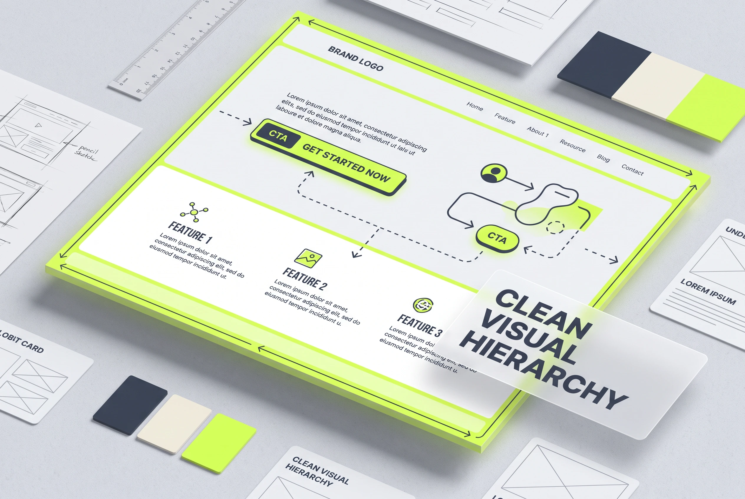
They also use visual hierarchy, making important stuff big and bold, less important stuff smaller. Your eyes should know where to look first, second, third.
How to check: Look at a site and squint a little. What jumps out first? Is it the thing that matters most? Or is everything competing for attention?
Sign #5: It Doesn't Hurt Your Eyes
Have you ever landed on a website and felt instantly overwhelmed? Your eyes don't know where to look first. A banner screaming at you. A pop-up demanding your email. Buttons everywhere. Text crammed into every corner. Fifteen things competing for your attention all at once. You don't stay long. Nobody does.
Amateur sites do this constantly. They try to say everything above the fold because they are terrified you won't scroll down. So, they continue cramming. The result is visual chaos that exhausts your brain within seconds.
Professional sites breathe. They use white space intentionally. Empty areas that give your eyes a place to rest. They understand that you don't need to see everything at once. They guide you through the page step by step. First this. Then that. Now this. Like a good conversation instead of someone shouting at you.
Remember, a good design feels calm and not boring!
Sign #6: The Code Is Clean
You will never see this one. It's invisible. But you will absolutely feel it.
Websites are built with code. HTML, CSS, JavaScript, and all that technical stuff normal people don't think about. When designers write sloppy code, problems show up everywhere. Pages load slowly. Buttons don't work right. Things break when you least expect them. Google gets confused and ranks you lower.
Professional designers write clean code. Organized. Efficient. Following current standards. They don't take shortcuts that cause headaches later.
This matters more than you would think. Clean code makes sites faster, which keeps visitors around. It makes them more secure, which keeps hackers out. It makes updates easier, which saves you money down the road. And Google actually prefers sites built the right way. They can tell when code is messy, and they punish it in search rankings.
How do you check for this? Honestly, you can't unless you're a developer yourself. But you can ask potential designers about their process. How do they write code? What standards do they follow? How do they test for quality? If they can't explain it clearly, that's a red flag. Good designers are proud of their craft and happy to talk about how they work.
Sign #7: You Can Actually Use It on Your Phone
We talked about mobile responsiveness earlier, but let's go deeper because this matters more than most people realize.
Some sites technically work on phones. The text shows up. The images load. By definition, they are responsive. But using them is pure misery. Buttons the size of pinheads that you can't tap without zooming. Forms that demand paragraphs of typing on a tiny keyboard. Menus that take five tries to open because your thumb keeps hitting the wrong thing.
Good user experience means the site is actually pleasant to use on any device. Buttons are big enough for thumbs, with space between so you don't hit the wrong one. Forms ask for the bare minimum, name and email, not your life story. Menus are simple and work the first time you tap them.
Professional designers test their sites on real phones. Not just in a computer simulator where everything looks perfect. They hold actual devices in their hands. They navigate with one thumb while walking around. They know how people really browse, distracted, in a hurry, sometimes with a bad reception. They build for that reality, not some perfect lab condition.
Sign #8: It Follows Web Design Best Practices
Every industry has standards. Web design is no different.
There are web design best practices that just work. Things like:
- Putting your logo in the top left that links home
- Having contact info easy to find
- Using common icon meanings (cart = shopping cart, magnifying glass = search)
- Making sure links look like links
- Keeping forms simple
Professional designers follow these rules. Not because they lack creativity, but because these patterns work. People expect certain things. Good design delivers what people expect.
When someone breaks these rules, it better be for a really good reason. Otherwise, they're just making your site harder to use.
Sign #9: Images Actually Add Something
You know those photos. The smiling people in business suits are shaking hands like they just made the deal of a lifetime. The diverse group of coworkers laughing around a conference table. The model staring thoughtfully at a laptop while holding a coffee. Stock photos that have been used a million times and feel like absolutely nothing.
Amateur sites are full of these. They are simply fillers or placeholders. They don't mean anything, and they don't make you feel anything.
Professional sites use images that actually matter. Real photos of real people who work at the company. The actual office, not some generic workspace. Custom graphics designed specifically for the brand. Images that tell a story about who you are and what you do.
And here's something else!
Good images load fast. Professionals compress them so they look great but don't slow down the page. Because a beautiful photo is useless if people leave before it loads. Every image should earn its spot. If it's not adding something real, it's just getting in the way.
Sign #10: It's Easy to Update
Here's something nobody thinks about until it's too late.
You get your shiny new site. You love it. Everything looks perfect. Six months later, you need to change your phone number. Or add a new team member. Or write a blog post. Simple stuff that should take five minutes.
And you can't.
The designer built it in some weird custom system that only they understand. Now you are stuck paying them a hundred bucks every time you need to update a comma. It's frustrating, expensive, and makes you feel trapped.
Professional web design means building on platforms you can actually use yourself. WordPress, Squarespace, something with a dashboard that makes sense. You should be able to log in and change text without needing to call for help.
Or at minimum, everything should be documented so another designer can step in later if needed. You shouldn't be held hostage.
Good designers want you to succeed without needing them for every little thing. They build for your independence, not their job security. That's how you know you have found the right one.
Sign #11: Security Isn't an Afterthought
Hackers love vulnerable websites. And there are a lot of them out there. Small business sites get attacked every single day because owners think nobody would bother with them. They're wrong.
Professional designers build security in from day one. They don't wait until something bad happens. They choose secure hosting that actually protects your site. They install SSL certificates, that little padlock you see in your browser bar that tells visitors your site is safe.
They set up automatic backups so you never lose everything. They keep software updated because outdated stuff is how hackers get in.
Amateurs ignore all of this. Security sounds boring so they skip it. Then their clients get hacked and they act all surprised. “I don't know how this happened.” Yes, you do. You didn't do the work.
How do you check? Look for that padlock. Ask about backups. Where are they stored? How often do they run? Can you restore from them? Ask about updates. Who handles them? If a designer can't answer these questions clearly, run the other way. Security isn't exciting but neither is losing your whole site.
Sign #12: It Actually Achieves Goals
Here's the most important one.
A beautiful site that doesn't bring in business is just art. A good website does something. It gets phone calls. It makes sales. It builds your email list. Whatever matters to your business.
Professional designers ask questions before they start designing. What do you need this site to do? Who are your customers? What action do you want them to take?
Then they build everything around that goal. Every button. Every word. Every image. All pointing toward the same thing.
Amateur designers ask what colors you like and send you a template.
Big difference.
Ready for a Website That Actually Works?
So here's what to look for when you're hiring someone to build your site:
Fast loading. Works on phones. Easy to navigate. Text you can actually read. Clean code. Good security. Built to get results.
These are the signs of quality web design that separate the pros from the amateurs.
And here's the thing, you don't need to become a designer to spot them. You just need to know what to look for. Now you do.
At The Designers Agency, we don't just make things pretty. We build sites that load fast, work on every device, and actually bring in business.
We work on everything, from loading speed, mobile responsiveness, and clean codes. Because we know that's what separates good sites from great ones.
We think about user experience before we write a single line of code. We plan navigation structure so your customers never feel lost. We obsess over readability and visual hierarchy so your message actually gets through.
Let us handle your professionalss web design while you focus on running your business.
Table Of Content
Why Good Website Design Matters Sign #1: It Loads Fast Sign #2: It Works on Every Device Sign #3: You Know Where to Click Sign #4: The Text Is Actually Readable Sign #5: It Doesn't Hurt Your Eyes Sign #6: The Code Is Clean Sign #7: You Can Actually Use It on Your Phone Sign #8: It Follows Web Design Best Practices Sign #9: Images Actually Add Something Sign #10: It's Easy to Update Sign #11: Security Isn't an Afterthought Sign #12: It Actually Achieves Goals Ready for a Website That Actually Works?
Unlocking Digital Prowess through Innovative Solutions and Unparalleled Customer Service.
Get in Touch Now!

Ready To Grow Your Business Online?
Tell us what you need. We'll help you figure out the next step.
Phone
+1 (855) 554-4057Package